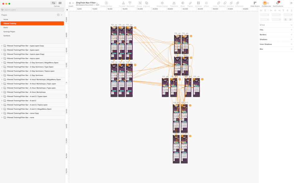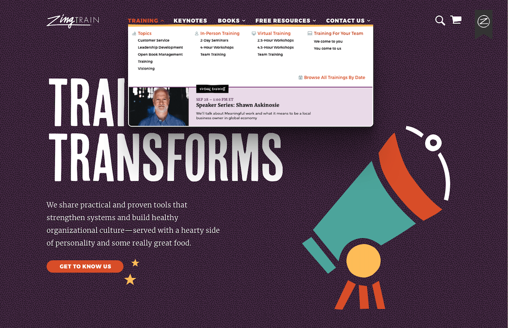

ZingTrain's main navigation was a single layer of menu items, and for a user to find the what they were looking for could take a lot of searching, not to mention the use of “zingy” terms that might not make sense. My team and I created a new navigation hierarchy and I designed the look of the dropdown menu. To get a better feel for how this navigation would move a guest through the site, I created a prototype in Sketch to mimic the movement, instead of seeing static images.